

Solutions Magazine:
Vanderbilt School of Engineering
Client Story:
Vanderbilt and Saxon Creative have quite a history together. Eighteen years ago, one of my very first freelance jobs was poster design for Vanderbilt Hospital. Years later, Vanderbilt’s Blair School of Music hired Saxon Creative to create and produce ongoing quarterly brochures as well as create poster design for an opera performance; and just recently, the Vanderbilt School of Engineering acquired SC illustration services for their Solutions Magazine. My experience working with Vanderbilt has always been extraordinary (not to mention the fact that I absolutely adore academia).
Project Scope:
I am always excited to work within academia. Add engineering and science to that, and I am in heaven. When Vanderbilt University’s School of Engineering approached me about doing a full cover illustration (front and back) and inside infographic for a study about Google’s data mining habits, I could barely wait to begin.
Vanderbilt computer science professor, Doug Schmidt, was able to track the practice for a study commissioned by Digital Content Next, a trade group representing digital publishers. My ultimate goal as an illustrator was to convey an overall view of the study, highlighting the intrigue and maybe even a little scariness about what Google captures.
Cover Illustration:
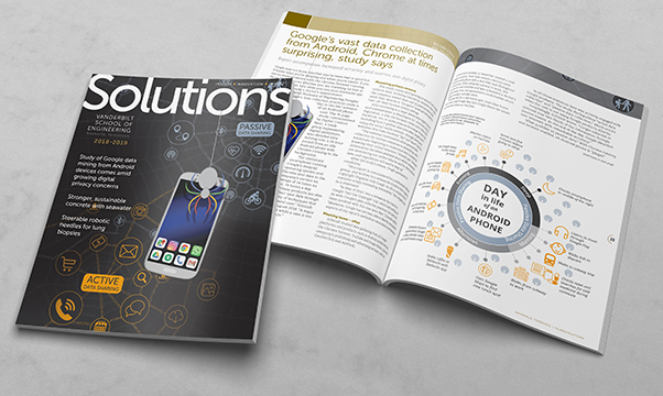
My main job as an illustrator was to highlight the fact that this is a story about the internet, in which Google is front-and-center. It is the story about how Google collects and “catches” user information, much like an insect might get caught in a spider’s web. To illustrate this, I decided to go with a more literal approach (by using a spider’s web), but the web itself is constructed of ones and zeros… in other words, binary code.
The spider looms over the Android phone, and its legs are colored with Google’s brand colors to infer that yes, indeed, this is Google we are talking about. Spot varnish was used during the printing process to highlight the spider and its web.
The data that gets caught in the web is illustrated through the use of well-known digital icons that we see every single day.
Adobe Illustrator
Adobe Photoshop
Adobe InDesign
Infographic:
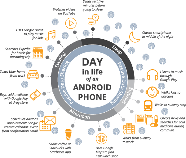
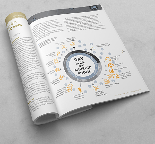
The purpose of the infographic in the inside spread is to illustrate just how often and when Google collects this information. I thought it extremely interesting that Google even collects our information while our phones are sleeping. I felt it was important to convey this as well, which is why I decided on a 24-hour clock. The “ping” symbols that are scattered throughout the graphic show just how often Google is gathering this information.
Adobe Illustrator
Adobe Photoshop
Partner Credits:
Pamela Coyle, copywriter
Mary Alice Bernal, layout and design

